 I was planning to go shoot this bus stop I saw that had all glass walls (was thinking to bounce a flash through it from behind a person inside for a rim/silhouette and see how the light bounced around through the dirty glass) but it wasn't dark enough the first time I went over and never made it back again.
 Anyways... on the way back we stopped at this playground, nothing too exciting but I wanted something to work with cuz I had some new ideas for post. Pretty lucky on this shot because I just put the camera on the ground at the bottom of the pole and hit the shutter.
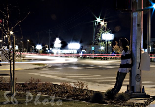
When I started working this picture my main goal was to really work with the colors. Spent alot of time with hue/saturation with each different color. After I felt good about the colors I wanted to give the shot a drawing/comic book edit. I blew out the sky to make it more uniform and went and fixed the imperfections. Really tried to make it look like a drawing by smoothing out anything that wouldn't really be drawn. Went with and untraditional crop and I'm not to sure about it, I'm kinda liking it. Like it or hate it its something different.

2 comments:
I would really like to see what the uncropped version looks like Where is your contact sheet? Remember, that needs to be posted each week so I can see that you actually shot more than 1 photo all week.
For this image, I think cropping some more off the top would be good. All that empty white space- top right- does nothing for the image, the eye gets sucked into there and has a hard time getting out.
Keep shooting, pushing yourself as you do, and making yourself better. Continue to ask questions, look to others work for inspiration, and do what you love to do.
Honestly, dude. I do not like this pic. The colors are just distracting. Not bright enough to get a drawing effect, and not subtle enough to be anything worth looking at. To be brutal, this pic just doesn't inspire anything. It doesn't make you want to go out and try to get that same effect or picture.
Anyway, back to trying to make it look like a drawing. If that was the effect you were trying to go for, you should have used more uniformed colors, or used a light colored pencil filter on it to get the texture of the paper. Not only that, but drawings have lots of problems, they aren't smooth, and you missed the wood completely!
I also agree with Twitch. That corner doesn't work with the picture at all. I also think you should have made the sky a darker grey to make it more uniform. And, one more thing is that you probably should have toned down the reflection in the bar. It's fairly distracting.
Post a Comment